Instructions: 2019 RHA Atlas Indicators by Detailed Geography
This dashboard allows the end-user to view geographic and temporal trends for a wide range of health indicators provided via the 2019 MCHP RHA Atlas data extras, As illustrated below, the dashboard outputs can be refined using the filter drop-downs. This allows outputs to be portrayed by rates or counts, by different geographic levels, and for specific time periods.
Note: This dashboard currently contain data on only 6 indicators, with more to come as time and resources permit.
Note: This dashboard currently contain data on only 6 indicators, with more to come as time and resources permit.
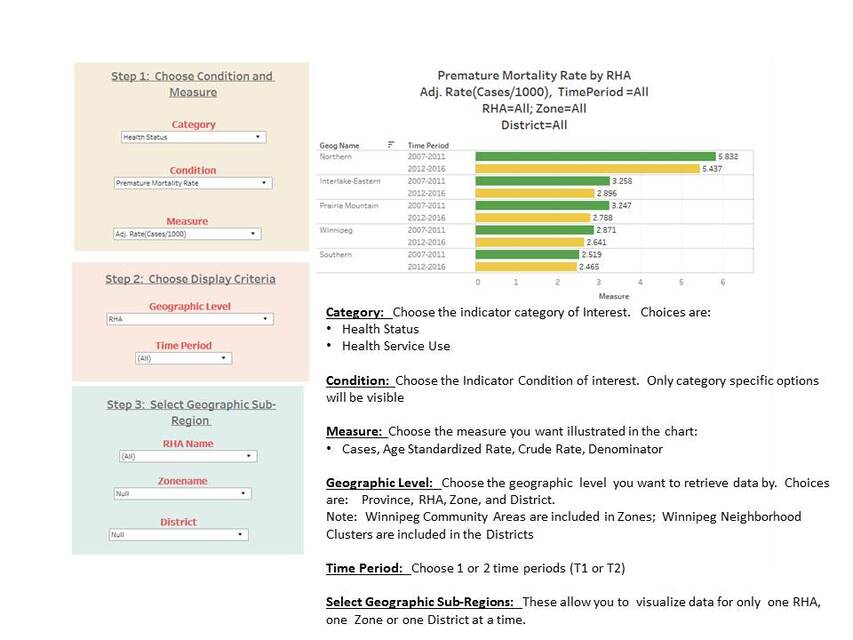
Tableau Dashboard Instructions:
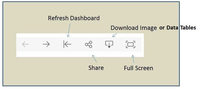
- Refreshing the Dashboard: The dashboard can be refreshed (taken back to its beginning state) by clicking on the Refresh button at the bottom right of the screen
- Viewing in Full Screen: To view the dashboard in full screen, click on the Full Screen icon at bottom right of the screen. When in full screen, you can return to the original view by clicking the ESC button.
- Exporting Images for Use in Reports: Images can be exported using one of four methods:
- Download the dashboard as a png file: Click on the download icon (see graphic below), and click on Image.
- Download the dashboard as a pdf: Click on the download icon, and then click on PDF
- Download the dashboard as a PowerPoint file: Click on the download icon and then click on Powerpoint
- Using the Snipping Tool in Windows to snip the portion of the dashboard you want to use in a presentation (this is the most reliable method)
- Exporting Data in Excel format:
- Click on the object of interest with your mouse (a graph or table)
- Click on the download icon and then click on Crosstab. This will export a copy of the data for that object in Excel format.
Geographic Disparity Ratio: The geographic disparity ratio is automatically calculated for each measure that is chosen. The geographic disparity ratio is calculated as the ratio of the age standardized rate in the worst performing geography vs. the best performing geography (i..e compares the geographic area with the highest rate of diabetes vs. the geographic area with the lowest rate of diabetes). It quantifies the relative magnitude of inequality of an outcome between geographic areas. A large geographic disparity ratio indicates a high level of inequality in health status across geographic areas. Note: The geographic disparity ratio varies depending on the level of geography chosen in the dashboard. Geographic disparity ratios will be smaller at the RHA level as compared to those generated at the Zone or District levels since smaller geographies have more extreme rates (and therefore higher comparative ratios between the highest and lowest rate values).
Avoidable Cases (Population Impact Number - PIN); The population impact number (PIN) is automatically calculated for each measure that is chosen. It quantifies the potential reduction in the number of cases that would occur in the total population in the hypothetical situation in which all geographic areas experienced the same rate as the best performing geographic area (area with the lowest rate). Note: On this dashboard, the PIN is calculated using crude rates and does not take into account the age structure of the population. As a result, the PIN may be over or under-estimated slightly depending on the degree to which the age structure of the populations in the analysis vary from each other. It is important to remember that the the PIN is only a hypothetical estimate of the number of cases that could be potentially avoided (basically a thought experiment).
Avoidable Cases (Population Impact Number - PIN); The population impact number (PIN) is automatically calculated for each measure that is chosen. It quantifies the potential reduction in the number of cases that would occur in the total population in the hypothetical situation in which all geographic areas experienced the same rate as the best performing geographic area (area with the lowest rate). Note: On this dashboard, the PIN is calculated using crude rates and does not take into account the age structure of the population. As a result, the PIN may be over or under-estimated slightly depending on the degree to which the age structure of the populations in the analysis vary from each other. It is important to remember that the the PIN is only a hypothetical estimate of the number of cases that could be potentially avoided (basically a thought experiment).
Sorting the Data Table:
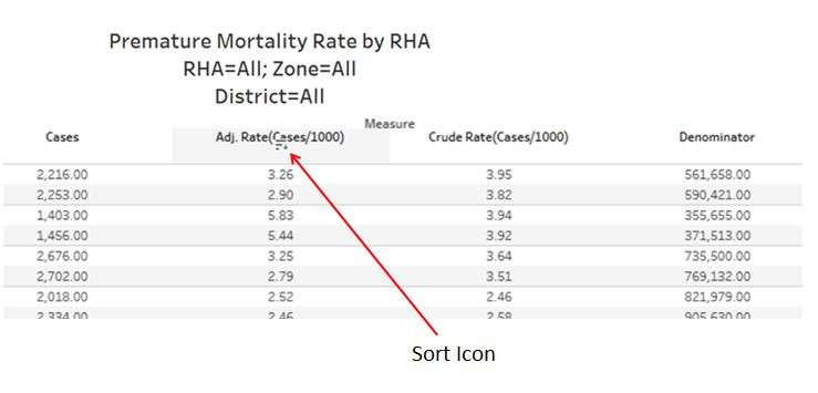
The data table can be sorted by clicking on the sort icon that sits right under the field label for each column. Hover over the field label name to make it visible. Clicking multiple times will sort the table by its original sort order, ascending and then descending.
The data table can be sorted by clicking on the sort icon that sits right under the field label for each column. Hover over the field label name to make it visible. Clicking multiple times will sort the table by its original sort order, ascending and then descending.